 ItemAtlas3D
ItemAtlas3D
ItemAtlas3D
Home → Complete Manual
Every screen, and — the part that matters in this app — every route to every action. ItemAtlas3D usually gives you three or four ways to do the same thing, each quicker in a different situation. This manual lists all of them.
Wherever there is more than one way to do something, you will find a table like this one. Nothing in it is a “correct” way; pick whichever suits where your hands already are.
| Route | Where | Best when |
|---|---|---|
| The obvious one | Which screen and which button | The situation it wins in |
Buttons are named exactly as the app labels them, like Decompose. Keys look like Esc. Menu paths look like More → Settings → Data.
Four ideas hold the whole app together.
A thing you own. Name, optional category, unit, photos, barcode, description.
Anywhere you keep things. Locations nest to any depth.
Belongs to the pairing of an item and a location — so one item can be in many places, each with its own count.
Every piece you draw quietly owns a location of its own, so any piece can hold items or more furniture.
That third one is worth dwelling on. There is no single “quantity” field on an item. Four screws in the garage and two in the kitchen drawer are one item with two rows; the total shown at the top of its page is the sum. Everything about stock — low-stock thresholds, expiry dates, the plus and minus buttons — works per row.
The kind is not bureaucracy: it decides which designer the location opens and what may go inside it. A Room may sit at the top of the tree with no floor or building above it, so you can use as much or as little of the hierarchy as you want.
| Tab | Contains |
|---|---|
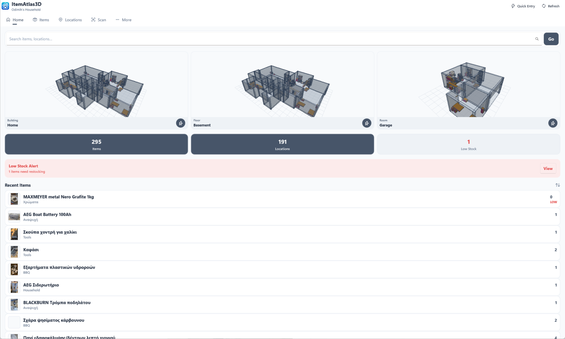
| Home | Live 3D tiles for the Room, Floor and Building you used last, each opening its designer on a tap and carrying a walk button of its own; counts; low-stock and expiring cards; a combined search over items and locations; recent and favourite items. |
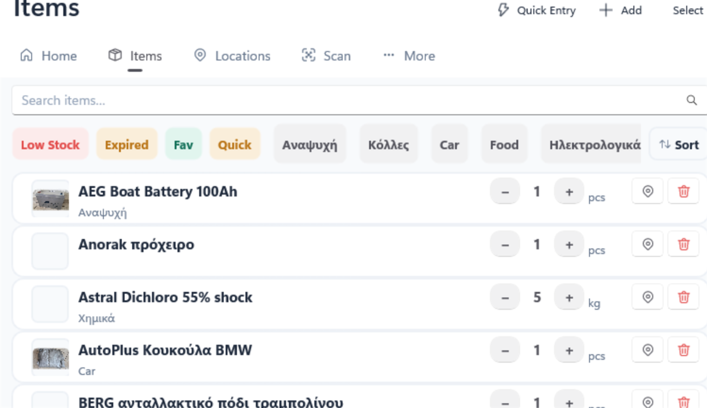
| Items | The full item list. Toolbar: Quick Entry, Scan, Add, Select (and Refresh on desktop). |
| Locations | The location tree. Toolbar: Add, Expand/Collapse all (and Refresh on desktop). |
| Scan | The camera, recent scans, and manual code entry. |
| More | Three tabs of its own — see below. |
| Tab | Holds |
|---|---|
| Account | Sign in and out, the household picker, members and invite codes, joining a household, sync status and Sync now, and Delete account. |
| Settings | Appearance (light/dark, colour theme), notifications, step size, default heights, the label printer, category and furniture-type management, backup, restore, import, export, and About. |
| Subscription | Your current plan and what it allows; the Offline, Cloud 2 and Cloud 5 plans with their prices; Change your plan once you subscribe; Restore Purchases. See Plans. |
The tab you were on is remembered, so changing the theme does not throw you back to the top.
| Route | Where | Best when |
|---|---|---|
| Add | Items tab toolbar | One item, with care — you land on the full page. |
| Quick Entry | Items toolbar, Home, or a designer’s toolbar | Unpacking a shopping bag. Pick the location once, then type name and quantity repeatedly. |
| Scan an unknown barcode | Scan tab → Add to Inventory | The product has a barcode — the name and category are filled in for you. |
| The inline entry bar | Room designer → the keyboard button in the toolbar | You are already looking at the shelf it belongs on. It goes straight into the selected piece. |
| Add new item | Inside a designer’s item list | You went looking for something and found it does not exist yet. |
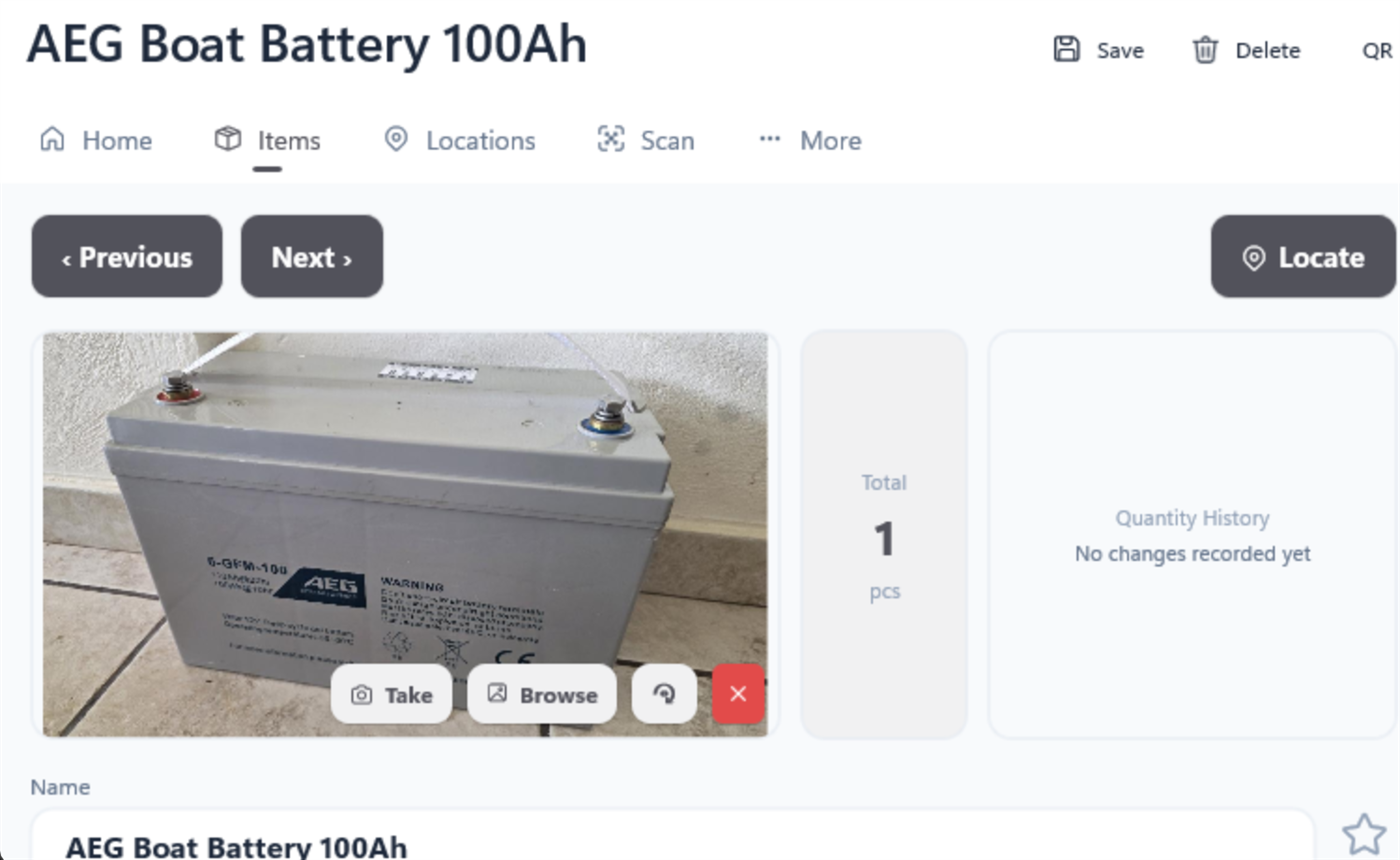
Everything about one item. The toolbar carries Save and Delete; Previous and Next step through your items alphabetically, saving as they go, and Locate jumps to where the item is.
| Area | What it does |
|---|---|
| Photo | Take or choose one; tap it to view full screen with pinch-zoom; rotate it 90° at a time. |
| Name, description, category, unit | Units are free text with suggestions; categories carry a colour. |
| Barcode | Type it, or tap Scan to capture it with the camera. |
| Step size | How much one tap of + or − moves the quantity. Either a fixed number, or a percentage of what is there, set once in Settings. |
| Locations | One row per place this item is kept: quantity, expiry date, minimum stock, a default marker, and its own Locate. |
| History | Every change, in plain words — Quantity 3 → 5 in “Garage”, Moved from “A” to “B” — with a quantity chart above it. In a shared household it also says who made each change. |
| Route | Where | Best when |
|---|---|---|
| + / − | The Items list row | Everyday counting. Acts on the default location, or the first one. |
| Tap the number | Items list, or an item’s location row | You know the exact figure and want to type it. |
| + / − per row | The item page | The item is in several places and you mean a particular one. |
| Quick Entry | Anywhere | Adding stock to a location repeatedly. Typing an existing name adds to it rather than duplicating it. |
| Scan the barcode | Scan tab | You are holding the thing. It opens the item with the quantity ready to edit. |
Taking more than one place has. If you subtract more than the default location holds, the app works down your other locations and shows you the plan before doing anything: Kitchen → Drawer 3: 6 → 0, Garage → Shelf 2: 4 → 3. Proceed? If the total is not enough anywhere, it says so and offers to zero everything.
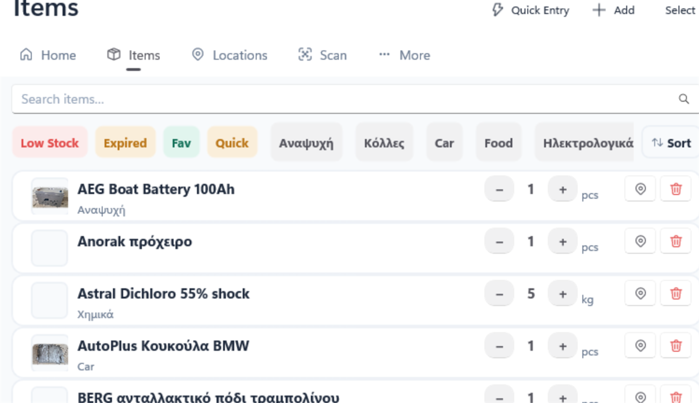
Tap Select in the toolbar, tick the rows you want, and the bar at the bottom offers: delete, set a category, mark as favourite, and move them all to another location.
Tap an item’s name in the list to edit it in place. Enter commits, Esc cancels, and the row re-sorts itself afterwards. Locations work the same way.
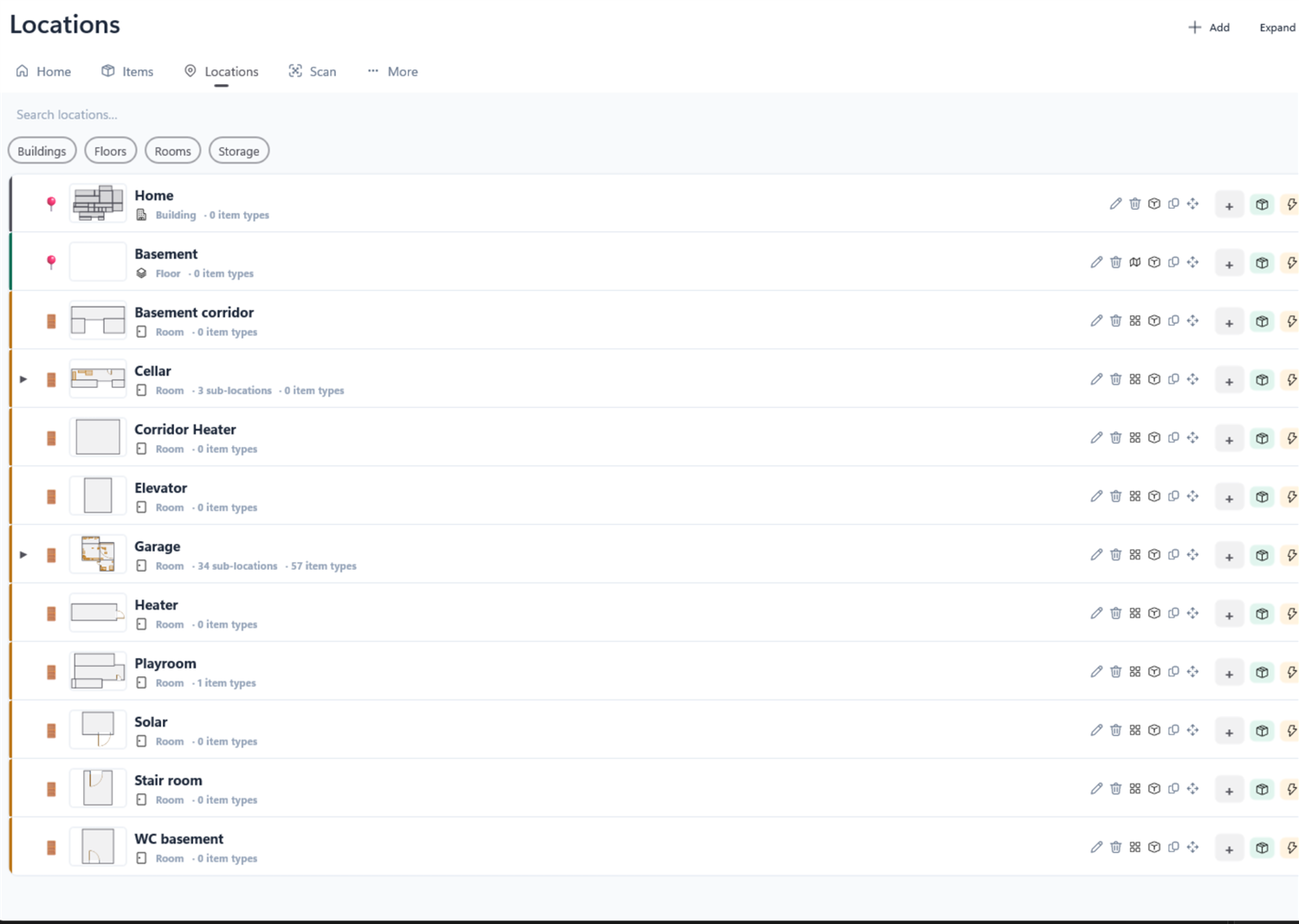
| Route | Where | Best when |
|---|---|---|
| Add | Locations toolbar | A new top-level place. |
| Add with a row selected | Locations tree | A child of that location. |
| Draw a piece of furniture | Any designer | The usual way. Placing a cabinet creates its location for you. |
| Create new room | Floor plan → the room picker | You are laying out a floor and need a room that does not exist yet. |
| Create new floor | Building view → the floor picker | Same, one level up. |
| Subdivide | A container’s action bar | Many identical compartments at once — six drawers, eight shelves. |
| Auto-box | Quick Entry or a designer | Each item gets a box of its own as you add it. |
| Action | How |
|---|---|
| Rename | Tap the name in the tree and type. Or open it and edit the field. |
| Move somewhere else | The Move icon on the row, then choose the destination — the tree shows “Paste here” targets, including the root. |
| Copy a whole subtree | The Copy icon, then a paste target. Copies the structure — shelves, boxes, dimensions — but not the stock inside. |
| Delete | Open it and use Delete in the toolbar. If it has children the app says so and offers to delete the whole subtree. |
| Change its kind | Open it and pick a different kind chip. If that invalidates a floor plan or a building placement, the app names exactly what will be undone first. |
Chips at the top narrow to Buildings, Floors, Rooms, Storage or Furniture, and there is a name search beside them. With any filter on, the tree flattens to a plain list of matches; clearing it restores the hierarchy.
The app is ultimately a machine for answering “where is it?”. Here is every way to ask.
| Route | Where | Best when |
|---|---|---|
| Home search | Home tab | You are not sure whether you want an item or a place — it searches both and shows results as you type. Picking a place takes you to it: a room, floor or building opens its own designer, and a box or a cabinet opens the room it stands in with the piece framed and selected. |
| Items search | Items tab | You want the list itself narrowed, with filters and sorting. |
| Locate | An item row, the item page, or a single location row | You know what it is and want to be shown where. Opens the right designer, zooms in and highlights it. |
| Find | Inside a designer, and in the 3D view | Searching one space rather than everything. Lists furniture, loose items and items inside furniture, and jumps to whatever you pick. |
| Scan | Scan tab | You are holding the thing, or looking at a labelled box. |
| Inventory | Any piece, room, floor or building | “What is in here?” — a full indented list of a whole subtree. |
| Walk mode | 3D view | You would recognise it if you saw it. Walk round and read the panel. |
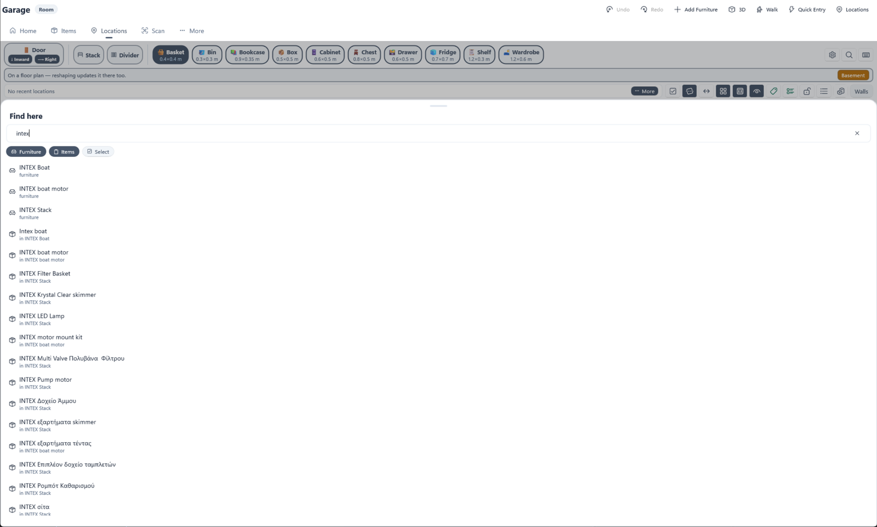
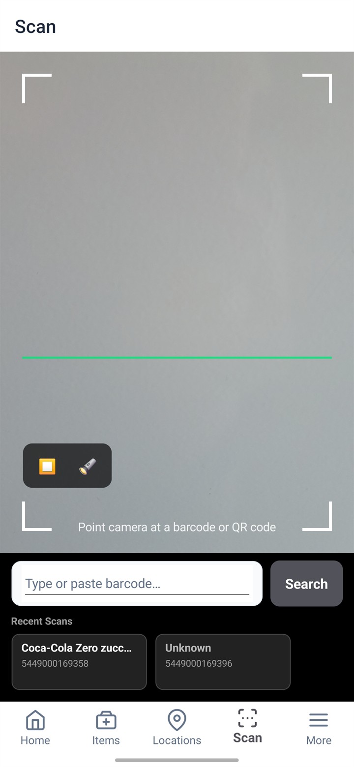
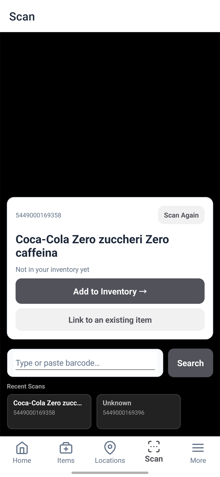
You can also type a code by hand, which takes the same three routes.
On the item page, tap Scan beside the Barcode field. The familiar camera opens with a banner across the top; scan the code (or type it) and you are returned to the item with the field filled in. Press Save to keep it. Cancel returns with nothing changed.
Any item or location can produce a QR label that opens it when scanned. Every route reaches the same label screen:
| Route | Where |
|---|---|
| Label | A selected piece’s action bar in the designer |
| Label | The container action bar, for the box you are inside |
| Print label | The location page toolbar |
| The label icon | A row in the Locations tree |
| The printer button | A Quick Entry row, to label something you have just added |
A label carries the QR code and the name in plain text, so you can read it without a phone. The label screen shows a preview, the tape size, the printer, the darkness and the number of copies, and one Print label button.
Three plan views and one 3D view, sharing the same canvas, the same gestures and most of the same buttons.
| Designer | You lay out | Opened from |
|---|---|---|
| Room designer | Furniture and items inside one room | A Room’s designer icon or its plan thumbnail |
| Storage designer | Shelves and boxes inside one container | Drilling into a piece of furniture |
| Floor plan | Rooms on a floor | A Floor’s row |
| 3D view | Nothing — it shows, and lets you walk | 3D in any designer, a Building row, or a Home tile |
| Route | Best when |
|---|---|
| The designer icon on a Locations row | You are browsing the tree. |
| The plan thumbnail on that row | You recognised the shape. |
| A 3D tile on Home | Carrying on where you left off. |
| Locate on an item | You want the designer and to be shown the spot. |
| Designer on a selected piece | Going one level deeper, into a cabinet. |
| The action button on a location page | You were editing its details anyway. |
| The expand button on the 3D preview inset | The little preview is not big enough. |
| Gesture | Touch | Mouse & trackpad |
|---|---|---|
| Zoom | Pinch | Wheel, or the + / − buttons |
| Pan | Two fingers | Alt+drag (⌥ Option+drag on a Mac), middle-button drag, or two-finger scroll |
| Fit everything | The ⤢ button | |
Zoom goes to twelve times, which matters more than it sounds: badges and pins have a maximum size on screen, so zooming in genuinely separates things that overlap when zoomed out.
It also goes below the fitted view, down to a quarter of it, so you can pull back and see empty ground around a building — which is how you place a garage clear of the house. ⤢ still returns to the fit rather than to the smallest zoom.
| Button | Does |
|---|---|
| Undo / Redo | Steps back and forward through everything you have done since opening the designer, including deletions of whole cabinets. |
| Add Furniture | Arms placement. Tap the canvas to put the selected type down. |
| 3D | Opens this space in the 3D view. With a piece or a zone selected, it opens just that. |
| Walk | Drops you inside it in first person. |
| Quick Entry | Opens Quick Entry with this location already chosen. Room designer only. |
| Locations | Back to the Locations tree from any depth. Always the last button. |
They are in that order, left to right, in every designer. A floor plan says Room and a building Floor where a room designer says Add Furniture, a floor plan carries its ceiling Height after Locations, and a building puts Zone walls and Find before it. On a phone the words are dropped and only the icons are shown.
Small buttons that change how the plan behaves or reads. Each shows a banner naming its new state, and each remembers it — and these follow you between devices, so a plan looks the same on your phone as on your PC. (That can be turned off in More → Settings.)
| Toggle | What it does | |
|---|---|---|
| Multi-select | Tap several pieces to act on them together. | |
| Dimension lines | Measurements of the room’s walls, and of the selected room in a floor plan. | |
| Room dimensions | The whole room’s interior width × depth as one cross, as against Dimension lines, which measures each zone wall. On a multi-part room those are two different answers. A floor plan has the same pair, for the floor and for a room. | |
| Snap to wall | Seats a piece flush against a wall, both while you drag it and when you first place it. Snapping tightens as you zoom in, so precise work stays precise. | |
| Snap to zone | New zones snap and resize to line up with the corners of existing ones. | |
| Snap to corner/grid | Lines a piece up with the corners and edges of other furniture — and, when nothing else claims an axis, with the dot grid. Wall seating and corner alignment used to be one switch, so wanting one without the other was impossible. | |
| Grid | A dot grid at a real distance — see The grid. | |
| Floor beneath | Three states: off, drawn beneath your plan, drawn on top of it. Absent when there is nothing below — see The storey beneath. | |
| Merge shared wall | Draw a multi-part room as one outline, without internal partitions. | |
| Auto-zoom | Selecting a container frames it and opens the 3D preview beside it. The single most useful toggle in the app once a cabinet has eight shelves. | |
| Labels | Cycles all names → only the selected one → none. In “all”, names on small pieces appear as you zoom in. Its icon changes with its state, as Contents does. | |
| Contents | Cycles auto → all → off. “Auto” shows what is inside a piece only when you tap it, which keeps a busy corner readable. | |
| Ruler | Measure between two points on the plan — see The ruler. | |
| Spacer | Drops a guide box of a size you type — a walkway, a door swing. Not furniture. See Spacers. | |
| Lock zones | Protects the room’s shape while you rearrange furniture. The padlock closes when it is on. A floor plan calls it Lock rooms, a building Lock floors. | |
| Furniture list | Hides the contents list that a selected container draws beside itself, leaving just the tap-to-open bubble. | |
| Auto-box | Each item you place is wrapped in a box of its own. Hold it to choose which kind of box. | |
| Walls / Interior | Dimensions include walls | Whether the sizes you type and read are measured over the walls or inside them. A word rather than an icon, because it is the answer that matters. Rooms only. |
| Manage furniture types | The palette catalogue: add, resize and remove the types you place from. | |
| Find | Searches this space, and frames whatever you pick. Last in the strip. |
That is the order they appear in, left to right. A floor plan carries the same strip without the room-only ones — no merge, no auto-box, no walls/interior — and adds Select and Inventory at the end. The 3D preview toggle is not in the strip at all: it sits on the edge of the canvas, beside the inset it shows and hides.
Both plan designers can draw a dot grid at a real distance, so whatever you line up against the dots stays lined up. Every whole metre (or foot) is accented, which makes the grid a free ruler.
A floor plan can show the floor below the one you are editing, and a room designer the floor below the floor its room stands on: pale grey and dashed, with both wall faces drawn, so you have a wall to line a wall up with.
The button cycles off → beneath (blue) → on top (amber). Drawing it on top is the useful one once you have laid something out, because an underlay is invisible exactly where it matters. The underlay never changes the fit, and the button is not shown at all on a ground floor.
A measuring mode rather than an overlay: while it is on, pressing the canvas measures instead of selecting or dragging, so no measurement can move the sofa by accident. The button wears a violet border while the mode is live, and Esc leaves it.
| Key | While measuring |
|---|---|
| Shift | Force a level or plumb line. |
| Ctrl (⌘ on a Mac) | Freehand — every snap off, the axis lock included. |
| Esc | Leave the ruler. |
A width × depth guide box: a clearance, a walkway, “the fridge goes here”. It is deliberately not furniture — it creates no location, holds nothing, counts for nothing and never appears in the Locations tree.
In landscape a designer splits into a sidebar and the plan, with a slim handle between them. Tap the handle to collapse the sidebar and give the plan the whole screen; drag it to put the split where you want it, anywhere between about a fifth and three fifths of the screen. It turns blue while you drag, so you can see it has taken the gesture rather than registering a tap.
The width is kept as a proportion, so it means the same after you rotate the phone, and it lasts as long as the app is running. Collapsing and re-opening restores the width you dragged to.
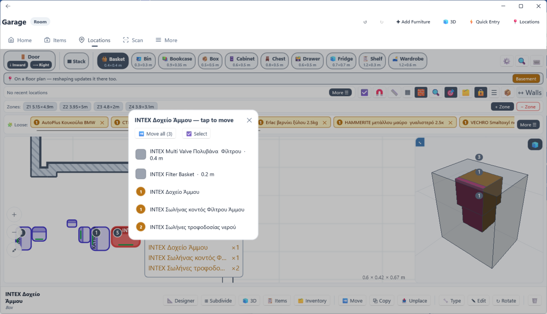
A small live 3D view of what you are working on, updating as you edit. It is not decoration:
Three gestures, and they never disagree with one another.
| Gesture | On a piece | On a badge or a pile |
|---|---|---|
| Tap | Selects it. Tapping again where pieces overlap cycles to the next one underneath. | Selects the pile. Tapping again cycles through anything else at that spot. |
| Long press | Picks the piece up to move it into something else — the next thing you tap is the destination. | Starts moving those items. |
| Drag | Moves it. | Moves the pile. |
| Double tap | Opens the thing — a piece’s contents, or an item’s page. | |
Stacked shelves and piles of items are the normal state of a full cabinet, so the app is deliberate about them:
| Route | How | Best when |
|---|---|---|
| Multi-select | Turn the toggle on, tap each piece | A handful, chosen individually. |
| Drag a rectangle | Drag across empty canvas | Everything in one area. It asks whether you meant furniture or items when both are caught. |
| Find → Select | Search a word, then All | Everything called “paint”. Repeat with another word to add to the selection. |
| The 3D inset | Tap boxes in the inset while multi-select is on | Shelves that share a footprint and cannot be told apart on the plan. |
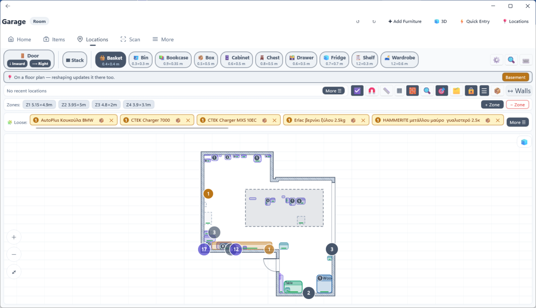
With several selected, the bar at the bottom offers Fit, Move, Arrange, Pack, Unwrap, Rotate, Tip, Unify, Delete and Clear — each acting on the whole selection as one undoable step.
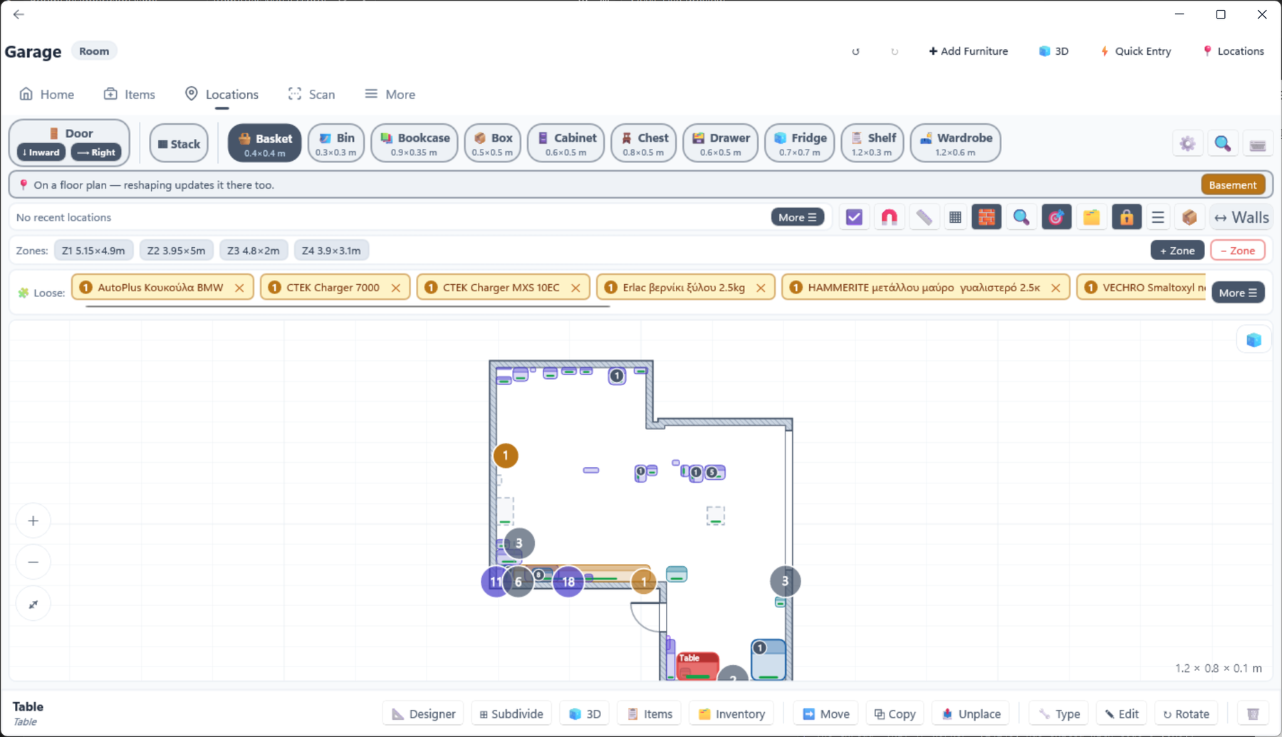
| Route | Where | Best when |
|---|---|---|
| Palette then tap | Pick a type from the strip, tap the canvas | The normal way. A panel opens for the name and real size, and the piece snaps as it lands — to walls, to other furniture and to spacers — rather than only once you pick it up again. The type stays selected, so each further tap places another (Box2, Box3…) until you press ✕ Cancel. |
| Palette then tap a piece | Same, but tap an existing piece | It goes inside, or on top of, that piece — you choose which. |
| The unplaced tray | The strip of locations with no place on the plan yet | A cabinet already exists in the tree and needs putting on the plan. |
| Subdivide | A container’s action bar | Many identical compartments at once. |
| Copy | A selected piece, then tap a spot | A second identical cabinet, complete with its shelves. |
| New type | The palette’s manage button | Nothing in the palette fits — define your own, with its own size. |
The palette also holds two special pieces:
| Route | How | Best when |
|---|---|---|
| Drag | Press and drag it | Anywhere on the same plan. |
| Long press, then tap | Hold the piece, then tap the destination | Putting it inside something. Works over any distance and needs no steady hand. |
| Drag it onto another piece | Release over it | You are offered Place beside (with a side to choose), Nest inside or Stack them. |
| Move | The action bar | The destination is not on this plan, or is a shelf you would rather pick by name. |
| Long press in the 3D inset | Hold a box in the inset, then tap the canvas | Getting a piece out of a cabinet and back into the room. |
| Arrange | Select several | Repositioning a whole group at once — see §11. |
Edit opens one panel that does everything: name, width, depth, height, how high off the floor it sits, whether it is inside or on top of what it belongs to, which edge it lines up with, and a nudge in centimetres.
| Action | Where |
|---|---|
| Rotate | A quarter turn clockwise. Four taps return it to square. A container turns its contents with it. |
| Tip | Lays it on its side — a quarter turn in the vertical plane. |
| Fit | Grows it to fill its zone, or its container. |
| Type | Change what kind of furniture it is, keeping everything inside it. |
| Copy | Duplicates the piece and its whole inner structure — but not the stock. |
| Unplace | Takes it off the plan and puts it in the unplaced tray. The location and everything in it survives. |
| Delete | Removes the piece and what is inside it. Undo restores the lot. |
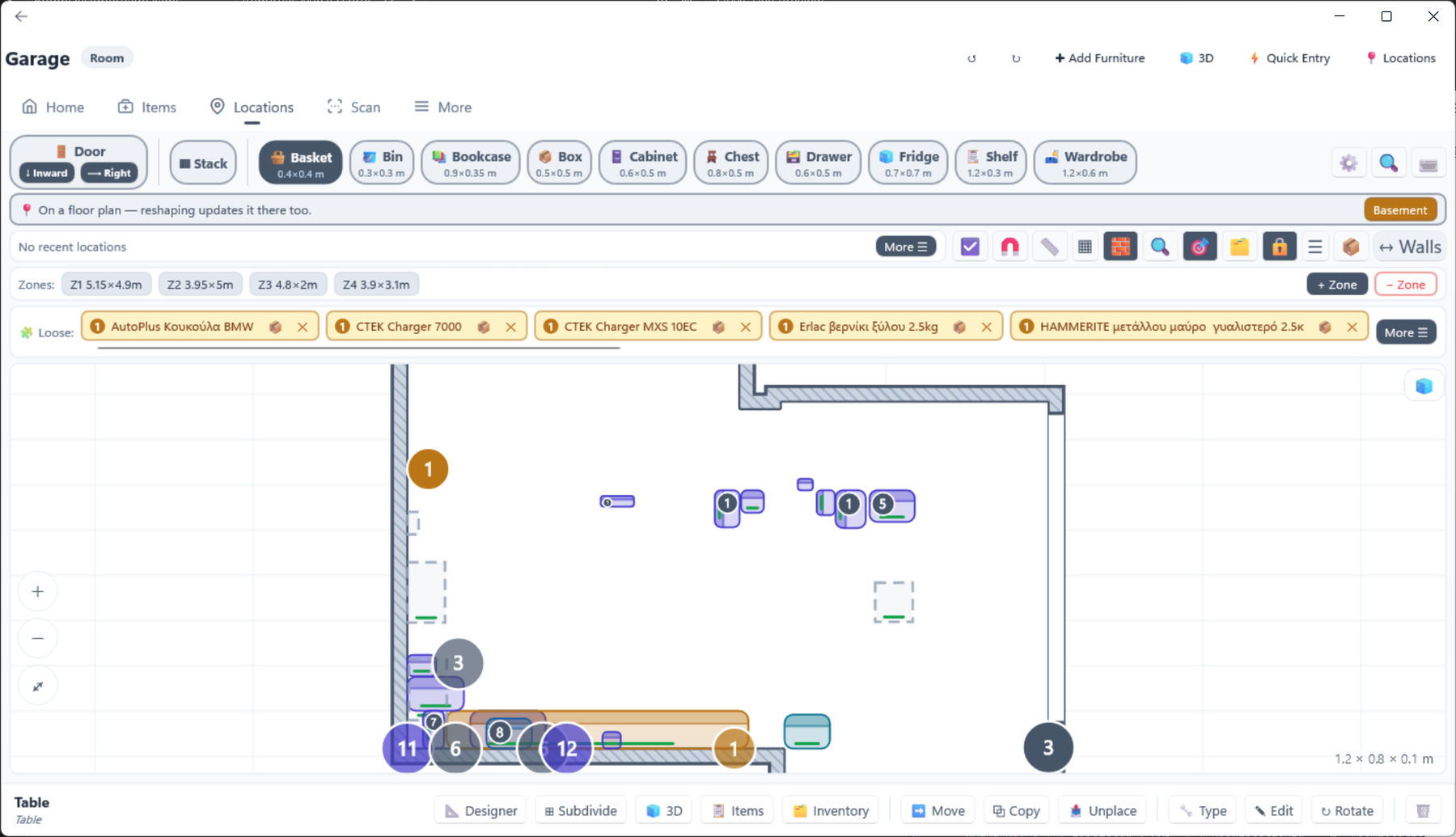
Any piece can be opened as a designer of its own, so you can lay out its shelves the way you laid out the room. Designer on its action bar, or double-tap it in the 3D inset. Locations in the toolbar returns to the tree from any depth; the back arrow goes up one level.
Every piece except a door and a divider is a container. Three tools turn a pile of separate pieces into something you can handle as one thing.
A stack is a transparent wrapper round several pieces so that they move, rotate and travel together. On the plan it is a faint outline; in 3D it is invisible, so you see the pieces themselves.
| To | Do this |
|---|---|
| Make one | Drag one piece onto another and choose Stack them; or place a Stack from the palette and drop pieces into it; or select several and press Pack. |
| Add to one | Drag a piece onto the stack, or use Move. |
| Take it apart, leaving the pieces where they are | Unwrap — the wrapper goes, the pieces stay exactly where they were. |
| Take it apart and spread the pieces out | Decompose — the contents go back onto the floor, side by side, and the container is removed. |
Fills a container with evenly spaced identical compartments: six drawers, eight shelves, three vertical dividers.
The compartments stay a group: editing any one of them reopens the whole subdivision, and deleting one asks whether you meant that one or all of them. Break group turns them into ordinary independent pieces.
Arrange is for the moment you have eleven boxes on the floor and want them stacked sensibly. It is an authoring tool: you describe the structure and it works out the geometry, checks that everything is supported, and shows you the result before anything moves.
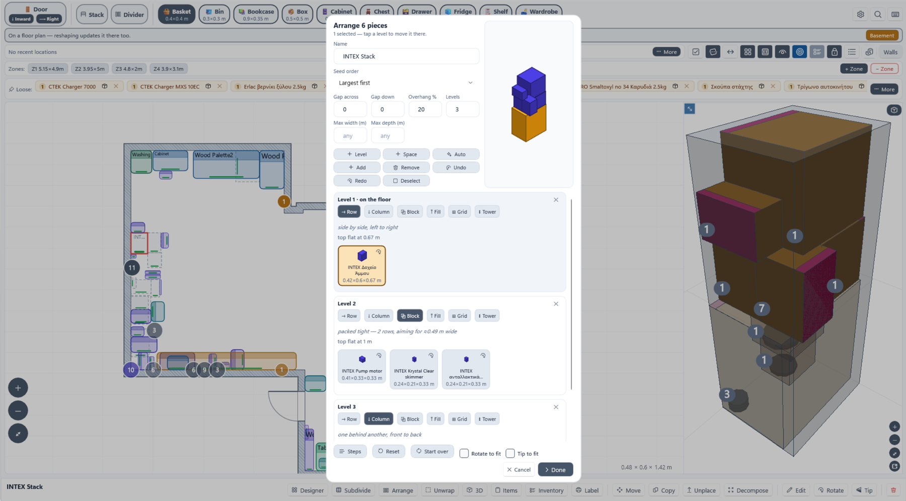
| Route | Gives you |
|---|---|
| Select several pieces → Arrange | A fresh arrangement of exactly those pieces. |
| Arrange on a container | Arranges what is already inside it. Not offered on a plain stack — a stack holds pieces where they are, and re-laying them is not what it is for. |
| Edit on a finished arrangement | Reopens it exactly as it stands, so you can adjust one thing. |
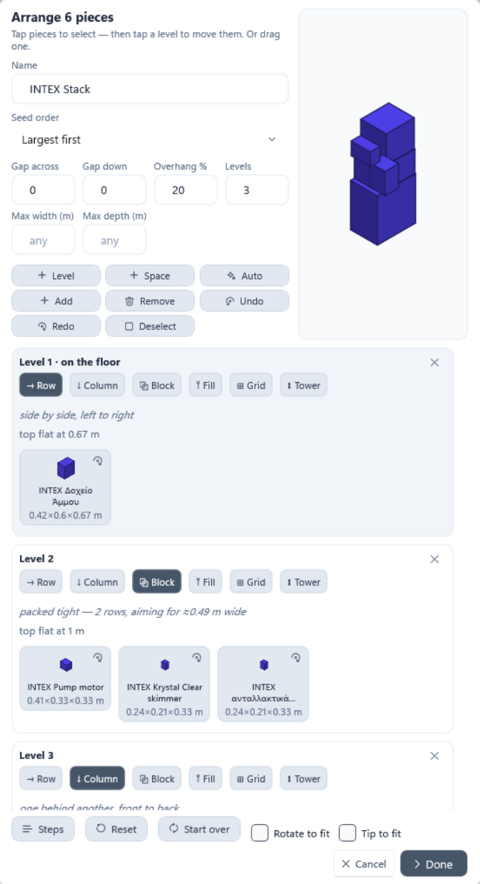
| Control | What it does |
|---|---|
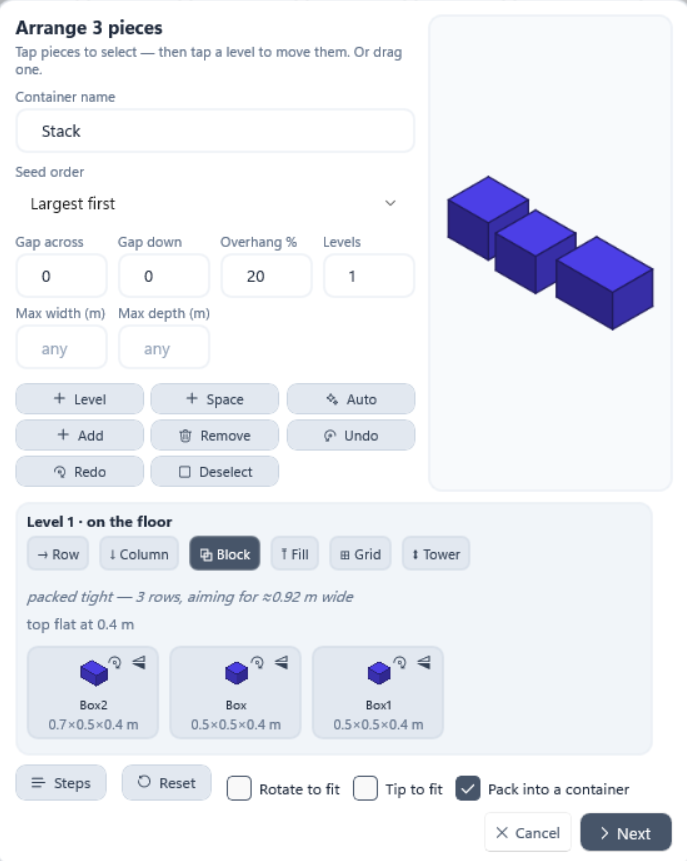
| Auto | Proposes a compact structure: a sensible base, then stacked upward. Levels steers how tall, and Max width / Max depth keep it inside a given corner. |
| Add / Remove | Bring another piece in, or take one out, without starting again. Added pieces land together on a new level of their own, and a line says which — drag them down from there if you wanted them lower. |
| Rotate / Tip on a chip | Turns that piece for real, immediately. |
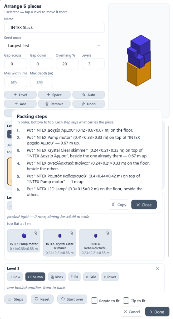
| Steps | The arrangement written out as numbered instructions — “put X on top of Y, 0.67 m up”. Copy it to the clipboard and build the real thing. |
| Reset / Start over | Back to how the editor opened, or discard the structure entirely. |
| Space | Inserts a deliberate gap into a level, beside the selected piece — the pieces after it move along. Sized from what is already on that level, and editable. Select the gap again to resize it. |
| Undo / Redo | Steps back through the edits you have made in this dialog. Nothing is written until you press Done, so this is separate from the designer’s own undo. |
| Deselect | Clears the ticked chips. Tapping the header does the same. |
| Pack into a container | Wraps the finished structure in a container so the whole thing becomes one piece. |
An item can be loose in a room — pinned to a spot on the floor — or inside a piece of furniture. This is the part of the app with the most routes, because the right one depends entirely on what you can see at the time.
| Route | How | Best when |
|---|---|---|
| Tap a tray chip, then tap the piece | The item tray under the plan | The everyday way. |
| Drag its pin onto the piece | The item is already on the plan | Moving something you can see. Dropping near the edge places it beside instead, so a near miss does not swallow it. |
| Select a shelf first, then tap the chip | Pick the shelf from the contents list or the mini-icons | The destination is one shelf out of many — naming it first is unambiguous. |
| Move on the item | Its action bar | Opens a banner: tap a shelf in the 3D inset, tap the piece on the plan, or press Other location for the full list. |
| Long press its pin | On the plan | Same move, started from the item itself. |
| Tap its badge in the 3D inset | The count badge over a piece | You are looking at the 3D and can see exactly which shelf. |
| Item page → Add location | Away from any designer | You know the destination by name and are not looking at a plan. |
| Quick Entry | Pick the location first | Adding several things to the same place. |
An item pinned in a room shows as a marker: a quantity badge, with its name on a pill beside it. Piles at the same spot collapse into one badge with a count — tap it for a list of what is in the pile.
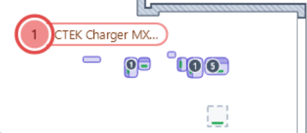
| To | Do this |
|---|---|
| Pin an item to a spot | Tap its tray chip, then tap the floor. |
| Move a pin | Drag it. Dropping it on another badge joins that pile. |
| Take it off the plan but keep it in the room | Unpin — it returns to the tray. |
| Split a pile up | Open the pile’s list, then Select the ones to move, or Move all. |
| Bring scattered items together | Select them and press Unify, or open a pile and use Merge. |
| Place several at once | Long-press a tray chip to start ticking, tick the rest, then Place. |
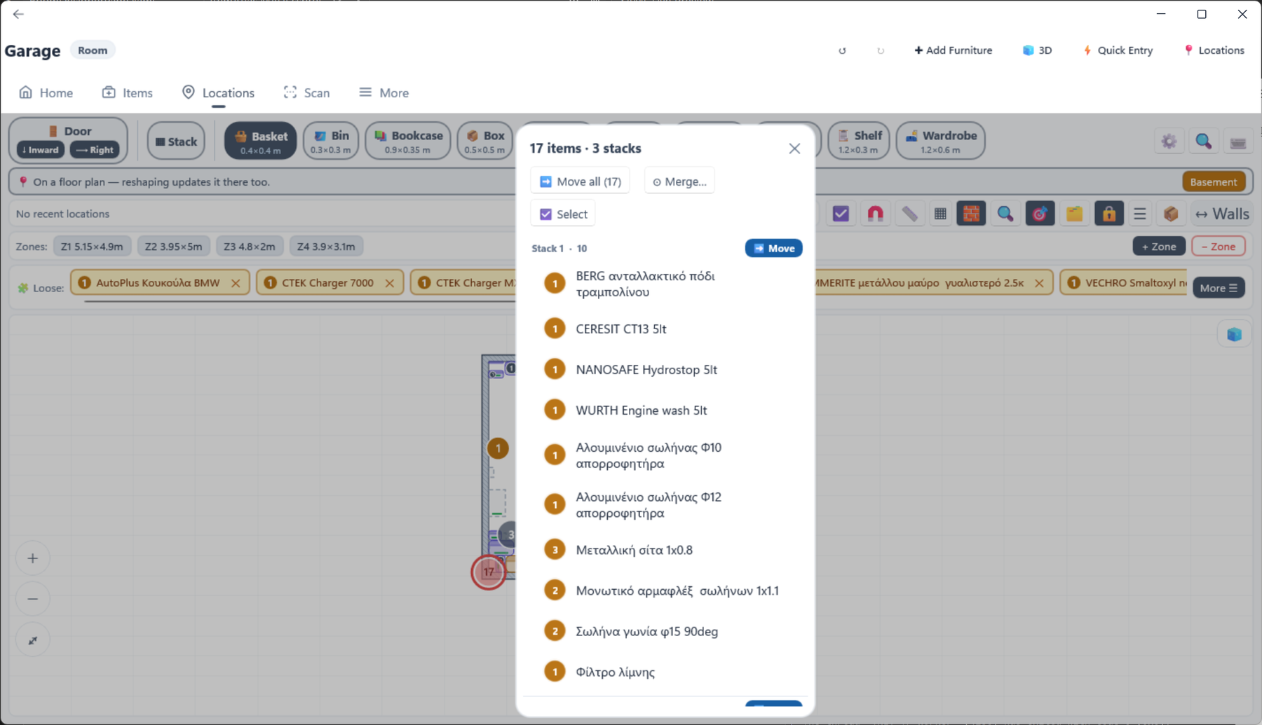
Wrapping an item in a box of its own is common enough to be automatic. Box on an item’s action bar makes one box per unit, named after the item, and puts the item inside. The Auto-box toggle does it for everything you place, and Quick Entry has its own switch for the same thing. You are asked for the box size once, and it is remembered.
Deleting a box does not destroy what is in it — the contents come back out as loose items in the room, and the app says so before it happens.
A room is made of one or more rectangular zones. One zone is a plain rectangle; add more and you get an L, a T or a U.
A Floor holds rooms. Room in the toolbar offers the rooms not yet placed; drop one and drag it up against its neighbours. Rooms share a wall rather than sitting flush, and the app enforces that. The tray lists every room not on this floor, in two alphabetical groups: rooms placed nowhere at all first, then rooms already standing on another storey.
| Feature | What it does |
|---|---|
| Fit to walls | Closes the few centimetres between a room and its neighbours that a tape measure and an architect’s drawing never quite agree on. |
| Red rooms | A room that overlaps a neighbour, or touches nothing, is drawn red with a warning triangle. Selecting it names which rule it breaks. |
| Teal rooms | A deliberately detached structure — a garage or a shed. With wall snap off, drop a room away from the others and the app offers this rather than refusing. |
| Height | The ceiling height of this floor, used by the 3D view and walk mode. |
| Lock rooms | Stops rooms being dragged while you work on furniture. |
A niche — say 1.4 m wide and 10 cm deep — is not a special kind of object. Build it as three zones along that wall, with the middle one 10 cm deeper. Neighbouring zones overlap by exactly one wall thickness, and that overlap is the shared wall, so every wall stays one thickness and no furniture is spent on the niche.
One limitation: the outside bumps out by the depth of the recess — the wall is uniform, the outline is not — and that bump is real outline on a floor plan, so a neighbouring room will sit against the bump rather than the wall.
A Building stacks floors, in 3D. Add a floor and it sits on top of the one below; drag it to line it up. A floor must rest on at least 60% of the one beneath it — anything less is refused, and a floor that stops being supported because you edited its rooms later is tinted red.
Removing a middle floor drops the ones above it down a level, so the stack stays continuous, and the app tells you before it does that.
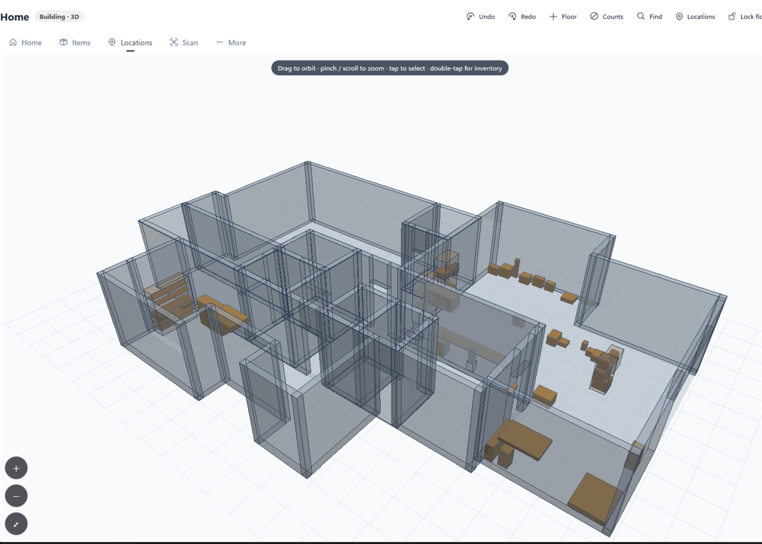
The same model, from outside. It shows exactly what your plans describe: rooms with real wall thickness, doorways cut through them, furniture at its true size and height, and a badge over anything that has things in it.
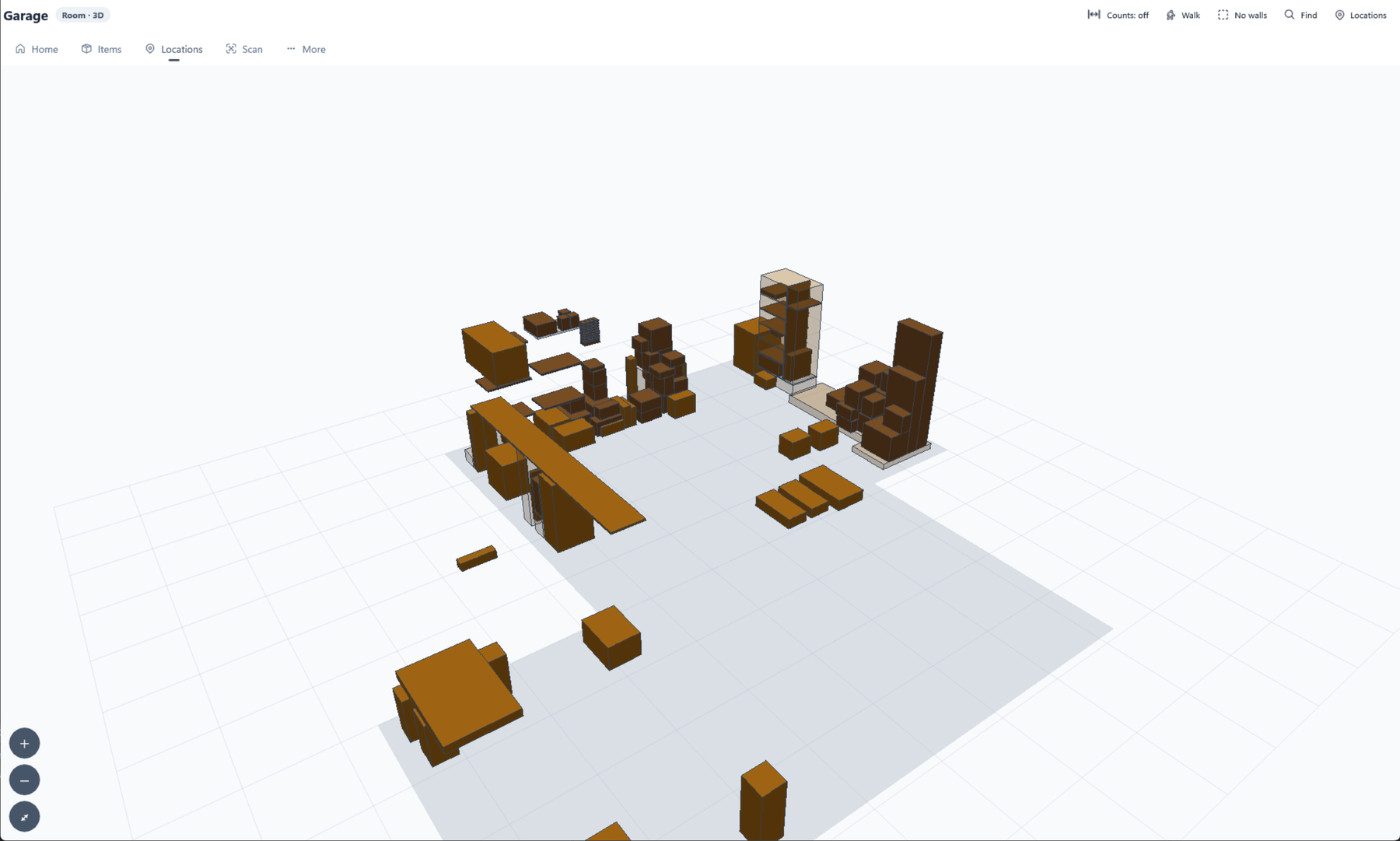
| Control | Does |
|---|---|
| Drag | Orbit. |
| Wheel, pinch, or + / − | Zoom. |
| Alt+drag (⌥+drag on a Mac), middle-drag, or two fingers | Pan. |
| Tap | Select. Tap the same thing twice to open it. |
The buttons sit in two places. Along the top, in the window’s own toolbar: Undo, Redo, +Floor (or Room, on a floor), Walk, Zone walls, Find and Locations last. The rest are on the bar across the view, in this order:
| Button | Does |
|---|---|
| Counts | The item-count badges: auto (as many as fit clearly — more appear as you zoom in), all, selected only, or off. |
| Ceiling | Shows or hides each storey’s ceiling. A ceiling is opaque, so you read the building from outside rather than through it. |
| Walls | Removes the room shell, leaving the floor and the contents. The quickest way to read a room from above. The icon fills in when the shell is drawn. |
| All walls / outer walls only | Merges a storey into one outline, so a floor reads as a single volume. Different from Walls, which takes the shell away altogether. |
| Wall snap / Corner snap | Line a floor up with the one beneath it — flush on one edge, or on a corner. They apply to moving a floor as well as to placing one. |
| Lock floors | Stops floors being dragged by accident. Last on the bar. |
In a building, the floors are chips along the left of the bar: tap one to select that floor, and +Floor shows a ghost at the pointer, already snapped to where it would land.
You can open the 3D view of any level: a whole building, one floor, one room, one zone or a single cabinet. Drill in on a selected piece narrows to that piece and its contents.
Walk puts you inside the model at eye height. It exists for the question a list cannot answer: what does this room actually look like, and what is in that thing over there?
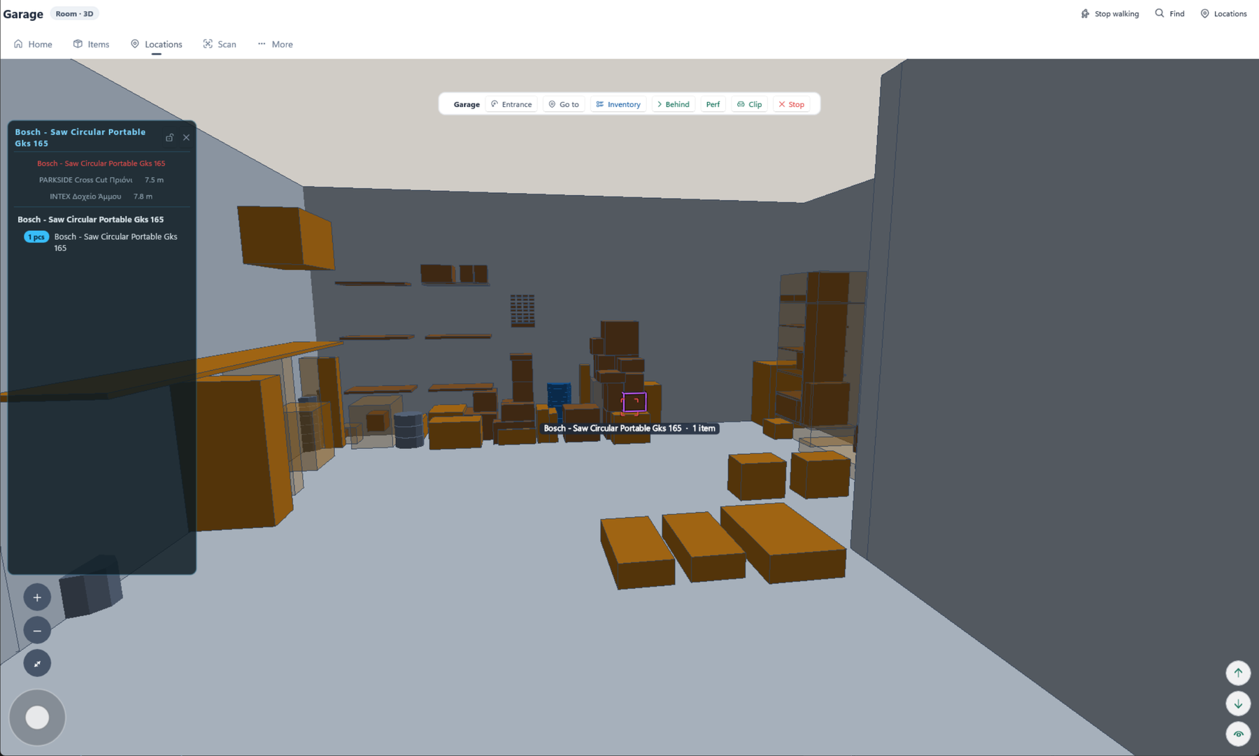
The quickest route is the small walk button on a Home tile, which puts you straight inside without asking anything. Otherwise, press Walk in any designer or in the 3D view. If the floor has doors it asks you to tap one to come in through; otherwise it places you in the room.
| Action | Touch | Keyboard |
|---|---|---|
| Walk | The on-screen stick | W A S D, Q E to sidestep |
| Look | Drag | Drag, or ← → to turn |
| Crouch / stand taller | The two round buttons, bottom right | C and R |
| Field of view | Pinch | [ and ] |
| Look behind something | The Behind button | X |
| Leave | Stop walking | Esc, or the back arrow |
Walls stop you and doorways let you through. Clip turns that off if you would rather walk through walls.
A household is one shared inventory. Everything you own belongs to exactly one of them, and the picker at the top of More → Account says which you are working in.
| Kind | What it is |
|---|---|
| Local | On this device only. What you get on first run, with no account. Nothing leaves the device. |
| Cloud | Synced, and shareable with other people. |
To lift a Local household into the cloud, select it and press Sync to cloud. This needs a Cloud plan; without one the app offers See plans and leaves the household as it is.
| Role | Can |
|---|---|
| Member | See and edit everything in the household. |
| Owner | All of that, plus rename the household, issue and revoke invite codes, promote or remove members, hand ownership on, and delete the household for everyone. |
Tap a member for the actions that apply to them. A household can have several owners; the last one cannot leave without either handing it on or deleting it.
A household can have as many members as its plan allows — two on Cloud 2, five on Cloud 5. A code for a full household is refused.
The most recent edit wins. That is reported rather than hidden: the sync summary names the conflict and who won, and Use my version instead puts yours back.
| Action | What happens |
|---|---|
| Leave household | You stop syncing. Your device keeps a local copy, complete, as it stood at that moment. |
| An owner removes you | The same — nothing is taken away from your device. |
| An owner deletes the household | The cloud copy goes. Every member keeps their local copy. |
| You remove it from this device | The local copy and its photos are deleted, and the app moves you to a local household. The cloud copy is untouched, so signing in and syncing brings it back. The trash icon on its row in More → Account. |
| You Delete account | See the account deletion page. |
| Plan | Price | What it gives |
|---|---|---|
| Free | €0 | 20 items and 10 locations, on this device. |
| Offline | €14.99 once | Unlimited items and locations, on this device. No cloud. |
| Cloud 2 | €5.99/month · €49.99/year | Sync and sharing, 2 members. |
| Cloud 5 | €8.99/month · €74.99/year | Sync and sharing, 5 members. |
Buy in More → Subscription. Once subscribed, Change your plan switches tier or billing period; the change takes effect straight away and the time already paid for carries over. Cancel in your App Store or Google Play account. Restore Purchases picks up a plan you already own. Buying inside the Windows app is not available yet; a plan on your account works there.
If a household ends up with more members than its plan allows, its owners see an amber card — Remove 1 member, or change plan — with Manage members and a date. If it is still over the limit by then, the newest members lose access (never the person paying). Their card reads You have lost access to this household; removing a member or raising the plan restores them immediately.
The household keeps working for 14 days, and its row in More → Account counts down: Subscription ended — 9 days to renew. After that it is locked: Home, Items, Locations and Scan send you to More, which shows This household is locked with See plans and Back up now. Nothing is deleted — renewing opens it again, and backup, export and account deletion keep working while it is locked.
| Feature | What it makes | Use it to |
|---|---|---|
| Backup | One file containing the database and every photo | Keep a complete, restorable copy. |
| Restore | — | Put a backup back, on this or any other device. |
| Export (JSON) | An open text file of your whole inventory | Move data elsewhere, or keep a readable archive. |
| Import | — | Bring an exported file back in. |
All four are in More → Settings → Data, with a progress bar — a backup with hundreds of photos takes a moment.
Backups and exports are files you hold. Nothing is uploaded to us, and we keep no copy — see the privacy policy.
More → Settings, in order down the page.
| Setting | What it does |
|---|---|
| Mode | Light, Dark, or follow the system. |
| Colour | The accent theme — Cool slate, Neutral grey or Classic blue. |
| Notifications | Low-stock and expiry reminders on or off. |
| Capitalise item names / location names | Capitalise the first letter of a new name typed entirely in lower case. Anything you type with a capital is left alone. |
| Sync designer appearance | Whether the designer view toggles follow you between devices. Grid spacing and spacers are not covered — both stay on this device. |
| Step Size % | How much one tap of + moves a quantity, as a percentage, when an item has no fixed step of its own. |
| Units | Metric or imperial for every dimension in the designers. |
| Wall Thickness | The default wall used when drawing rooms. |
| Default Floor Height / Door Height | Used by the 3D view and walk mode when a floor or a door has no height of its own. |
| 3D Nesting Depth | How many levels of contents the 3D view draws — 1 to 4, so a cabinet, its shelves and a box on one. |
| Expiry Warning Days | How far ahead something counts as expiring soon. |
| Label printer | Find and remember a NIIMBOT Bluetooth printer; set the print darkness. Android and iOS only. |
| Categories | Add, rename, recolour, merge and delete categories. |
| Data | Backup, Restore, Export, Import, clear the activity log, and Reset to Defaults. |
| About | Version, this manual, Contact Support, and the privacy policy. |
| Key | Does |
|---|---|
| Esc | Backs out of the innermost thing — a panel, then a mode, then walk mode, then the page. It never leaves a dialog stranded. |
| Delete | Deletes whatever is selected on a plan, with the same confirmation as the button. |
| Enter | Commits an inline rename, or a search term as a filter chip. |
| W A S D | Walk. Q E sidestep. |
| C / R | Crouch / stand taller, while walking. |
| X | Step to the next thing behind what you are looking at. |
| [ ] | Narrow or widen the field of view, while walking. |
| Shift | With the ruler on, forces a level or plumb line. |
| Ctrl (⌘ on a Mac) | With the ruler on, measures freehand with every snap off. |
| Alt+drag (⌥ Option+drag on a Mac) | Pan a plan, the 3D view or the 3D inset — the way to pan on a trackpad. |
| Gesture | Does |
|---|---|
| Tap | Select. Again in the same place, cycle to whatever is underneath. |
| Double tap | Open it. |
| Long press | Pick it up to move it into something else; on a badge, start moving those items. |
| Drag | Move it. From empty canvas, draw a selection rectangle. |
| Drag off the canvas | Cancel — nothing is placed or moved. |
| Pinch / two-finger drag | Zoom / pan. |
| Click, move, click — or tap, then press–drag | With the ruler on, sets the two ends of a measurement. The first with a pointer, the second with a finger. |
| Drag the sidebar handle | On a phone held sideways, resizes the sidebar. A tap collapses it. |
Common questions, troubleshooting and how to reach us are on the support page. In short: